Wednesday, April 12, 2017

Love Byrds

Hello April! Spring has arrived! The warmer weather is coming and so is a very special event. My friends Jeni and Kenny are getting married at the end of the month! Yay!!! Last month I had finished a piece for the couple as a wedding shower gift.


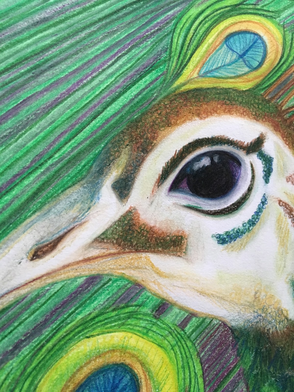
Jeni's new last name will be Byrd. So of course the bird/Byrd word play was perfect. The couple's favorite bird is the peacock. They received several gifts decorated with the gorgeous peafowl and we used feathers and bird cages as part of the decor.


 I had envisioned the peacocks facing each other and forming a negative space or hidden heart. I kept the female true to nature with her coloring and less vibrant feathers. I toyed with the idea of a white peacock but decided to keep my natural pair. This piece is 18x24 inches and done with oil pastel and color pencil.


The peacock colors are amazing!!! I loved using the rich jewel tones. I defined the smaller feathers first. This piece involved a lot of color pencil for all the fine lines of the longer tail feathers in the background.


The shadows were mostly done with purple to make the bodies of the birds stand out more. I always tell my students, don't shade with black. Black = Flat. There is a variety of textures in this piece that adds a rich tone to the already regal birds.


Ta-DA!!!


I love how it turned out and the couple did too!


I'm so excited to be part of their big day. Congratulations Jeni and Kenny! I love you.


Friday, January 27, 2017

Riley

The last of my 2016 holiday pet portraits, Miss Riley!

I gifted a portrait of this sweetie pie to my one of my best friends, Laura, and her husband, Chris. It was delivered a little late due to a couple rounds of sickness in the Tomaino household. It was worth the wait.

I got a picture of Riley, fresh from the groomer. I have the before and after shot. Riley is a Yorkie mix and gets longer face hair. She still had some wispies over her eybrows and throughout her chest so I was able to get into detail with lines in those areas. Isn't she cute? Her ears are HUGE and I love them!

I decided to work with the colors in her collar for the background on this portrait. The litte lady looks lovely with a pink and purple back drop. 

I love to document my process and give sneak peaks on my Instagram


Work in progress shots:


I utilize a photo editor app on my phone to find "fix spots" and I circle them. The eyes of course, are always the tricky part. I ended up brightening them a lot by "blending" with a white or almost white color pencil. I found that "blending" with white pencil in general really made this portrait work. It softens hard lines and dulls heavy colors. I send pictures to my Mom and my bestie, Kim, in most cases when my eyes don't want to work anymore and there was a tiny adjustment that made a huge impact. Kim was freaking out over the hair detail (A great confidence boosting freak out) and my Mom found the detail that finished Riley for me. 

I had too many teeth. 


Riley has a narrow jaw. Once it was fixed I had my "and if I touch it anymore I will ruin it" moment. I usually think I'm done several times before this moment happens but one area will nag me when I look at the piece. Its like and extension to my "stare and tweak" stage. Brutal! However, it usually leads to beautiful results. One of those beautiful results ere the reflection in her eyes. I have a whole new appreciation for white color pencil after this, you have no idea! I love love love how this turned out. 


Laura and Chris did too.


(Riley next to her portrait for at least one photo.)


Thursday, January 19, 2017

Rachel's Elephant

I was commissioned for an oil pastel piece featuring an elephant this past holiday season. The family that commissioned it is very near and dear to us and part of our Ohana, the Buttons. This elephant was for the girlfriend of our best man! We finally got to meet Rachel and we are full of joy that Jeremy found someone who compliments him so well.

The conversation I had with Mrs. Button was that Rachel loved elephants. There are a lot of elephants... so we narrowed down our list of reference to a sweet and gentle type of elephant. I had originally imagined something like this:

 
Painted elephants are just majestic. 

However, we went for a less "designed" version of an elephant. I searched for photo references and kept coming back to the Indian Elephant which are more brown in color and have smaller ears than the African Elephant. I still loved the idea of the Indian designs so my concept came to be and I got to work. 

This was the reference photo I used to bring my sweet elephant to life. 
(I don't know who to credit the shot to but its on Pinterest.)


I started to use a collage app on my phone to see the progress at each stage of the process. Super fun! I often take pictures of my work and make edit notes on them. 


Oh the lines for the wrinkles of the trunk were exquisite! I loved the subtle details that really brought this elephant to life. I used browns, greys, purples, yellows, and blues for just the elephant itself. The Indian design was with fuchsia, gold, purple, and blues. I lurrrvvveee that pop of color! Fuchsia is one of those "Jessie" colors. I have a lot of it in my wardrobe. I kept the aqua tone and used my kneaded earser to "wash" the color out and added some deeper hues to weight the background. 


She loved it. This became one of my favorite non-dog pieces.  


If you love it too and want one for yourself, you can find prints and goods on Redbubble. Please note that the JPG file and screen brightness can effect the color that you see. It will print more brown and balanced. 

I am already working on another piece for a date in March. It will be so hard not to share it before the big reveal. Stay tuned!


Friday, January 13, 2017

Peluche Portrait

This year I decided I would do some pet portraits for friends of mine as holiday gifts. The first one was for my Bestie, Kim. She adopted a white fuzzball named Peluche. This dog had belonged to a Hispanic family before finding his forever home with Kim and Mike. He happens to be bilingual! Good thing Kim is too. He is also comically known as Das Poochin' or Fluffy One. I give him snuggles when I get to visit. He is a sweetie.


I know Kim prefered Peluche with a longer hair length. I toyed with blending some details from multiple photos to come up with my portrayal of the dog. I wanted to use the red bandana for the portrait because of the significance to Kim and Mike. They had traveled to Spain a few years back and witnessed the running of the bulls.They brought back the little red bandanna for their boy.


I loved this picture of Peluche is in full eager and happy smile. So I used that for my main reference and took my creative liberties.

I decided that white dogs are more challenging that black dogs. Oil pastel stain paper and layer. So I had to stain sections of the drawing and erase the first layer. Once that was done go in with alternate color pastels and pencils to create definition. Here is the piece in stages:


Another challenge on this piece was getting Peluche's eyes. They are DARK and getting the hair around them to properly shape them was tricky. My "stare and tweak" stage was mainly focused on the eyes. I also decided that I should drink a glass of wine during that stage. Talk about being a nutcase. My husband, Tim, witnessed this and asked me "do you do this every time?" 

Why yes, yes I do.


The references are blended together and shown next to the finished work here. 

Detail shots:


I got to see Kim, Mike, and her family on Christmas Eve. I couldn't wait! The suspense! I managed to not show her sneak peeks early though. I'm a horrible surpriser...I get too excited. 

I uploaded a video of her opening this gift on Instagram!


She loved it!

Picture cred to Mike. Awww so sweet.

If you are interested in getting your pet or loved one's pet illustrated please send me an email at wildatheartillustration@gmail.com 

I will be working on getting a custom portrait listing on Etsy by April 2017.


Monday, January 2, 2017

New Year 2017

Happy New Year!

2016 is the year I became a mother-Jackie may have been born in 2015 but this was the year of lessons and finding a person I didn't even know existed inside of me. 

I needed to meet her. 

I became much more than Jackie's Mama. I love being her mother more than anything. I also love that in becoming her Mama I also found that I am more determined than ever in the pursuit of my passions with art. I found that I am more joyful in everyday things (Jackie sure helps this one). I found that I am stronger in my faith-I pray so much more and trust in His timing and purpose for me. I found that I am more patient and realistic about MY time as well. I need to give it to myself to grow and reach my goals, they could take years and that is OK. I also respect my time and  that pieces can't always be finished in 2 weeks while working a day job and that is OK too.


2017 will be a year of pushing the plans I already have into motion. It will be a year of new challenges and professional growth. It will be a year I take my health more seriously. My diet will be getting an overhaul-not 100% Paleo like before though. I learned my limits and tolerances the last time I had to do it so it should be more manageable this time around. This is also the year in which I choose joy and love as much as possible. I will make the choice to do something outside of the routines we have to breath fresh life into relationships. I want to celebrate the love in my marriage with Tim and strengthen our partnership as we continue our journey together as parents. 

I could go on and on with my optimism for 2017. 

I gave myself 7 resolutions this year to try to put it into focus.

2017 Resolutions

1. Say the compliments I think in my head for people out loud to them. It may make a difference to that person. The symbol of a Starfish is extremely special to me and the Starfish Story's mantra of "It made a difference to that one" is something I try to live by.


2. Teach Art Classes-this plan is already in the works and I can't wait to share more when the schedules are available!


3. Don't discount or give my work away. I don't give myself near enough credit for my time and effort. I still love to give portraits as birthday or holiday gifts, but no more favors because they are friends and family. My Mom gets discounted or free pieces because she adds to my art supply stash on a regular basis.

4. Have more of an online presence-Redbubble, Etsy, and Instagram are my big 3 to build up. 

5. Floss-I have horrible, cavity prone teeth. I have already lost 1 to a failed root canal. I shell out hundreds of dollars a year in dental work and it is crazy. The anxiety leaves me a wreck for days! So I have to give myself some tough love. I should be flossing, but lets be honest, a lot of people don't. It is time to change that!

Here is my daily reminder on my bathroom mirror:


6. Travel! I will be taking baby Jackie on her first flight and trip to AZ to see her Great Grandma Jackie in February! I'm so excited and nervous about the flights but I have backup with my Mom and sister going too.

7. Chalk Festivals-I want to do 3 this year. I will be returning to Sweet Chalk Fest this year in July. Travel may be required for others outside of NY. I am waiting for applications to open up and see which ones I will be going to. If I get my way I get to spend time with my friend, Julie! She is a chalk festival fan and a veteran to the "Jess Mess" that I am.


I will be blogging soon about the Holiday Shopping with Heart Challenge results and recent Custom Pieces once they have all been gifted by the end of January. Stay tuned!


Friday, December 2, 2016

Cheshire Cat

The Cheshire Cat is just one of those iconic literary characters. He has graced the silver screen a couple times now and there have been many illustrations and fan art works done of him. The book Alice in Wonderland by Lewis Carrol is a classic and can inspire any artist. I normally don't do recreations of someone else's imagination baby. However, this was a special request made by a family member that didn't work out. My vision sometimes doesn't fit another's.

Alice in Wonderland book illustration (This is in color, the original was black and white):
Disney's Alice in Wonderland animation:


Tim Burton's Alice in Wonderland:


I had conceptualized my composition for my Cheshire piece back in April of 2016. I made several doodles on a plane flight to Minneapolis and my seat neighbors probably thought I was a psycho for drawing creepy smiles over and over again. 

I had seen a few pieces or artwork that depicted trees in a different way and I opted to use birch trees for my piece and left them tall, scraggly, and odd. I thoroughly enjoyed drawing the birch trees for this piece. Oil pastel lended me the texture and impression I wanted with the bark's color.

I had toyed with the idea of combining the Disney animation and Tim Burton's creation together. The cat would be both purple and blue. I ended up going with Tim Burton's color choice. In the Disney animation the cat would disappear in ribbons (as if sliced) and would gradually fade in pieces.  Tim Burton's cat would apparate with a smoke like effect. I wanted to do a little of both. In my piece he is perceived as floating above the imaginary viewer below him. If it was hung high enough up the viewer could be you, not so imaginary. 


I have a rule with oil pastel and paints: 
"Don't shade with black. Black equals flat!" 
I broke it. (Hey it is Alice in Wonderland, right?) 

Having a flat color tone background to the tree and sky helped separate the main subject of the piece. Doing this also helped the piece keep a vertical pull without a solid break or horizon chopping it up. I used a full moon as a back light and upper anchor for the composition. Oil pastel is applied in layers so I did the deep blue first then applied the black. 

Tim Burton always has a creepy element to his work and full moons are a solid move. I know I got the smile and eyes right on my creepy cat too. 


Texturing his fur was a color challenge. There was a lot of pencil work in this piece and minor tweaking. When I say minor tweaking I really mean stare at it and wish you hadn't touched it moments. I sent this last image on the eisel to my best friend, Kim, who made one suggestion and it made a huge difference! Sometimes your eyeballs are all detailed out when you have been working for hours on end. The difference is the darker shading past the cat's head which gave more depth and a hint of the "floating head" the cat is known for. 

I am quite pleased with the result. I impressed myself! The peak of his image had already gotten some interest and I hope that he makes any Alice in Wonderland or Tim Burton fan happy. 

"Tim Burton's Cheshire Cat Fan Art"
Wild at Heart Illustration Style

Prints will be available on Redbubble and Society6 for now. I will be keeping prints in house and selling through Etsy soon. 


As always stay tuned!